UI/UX Design
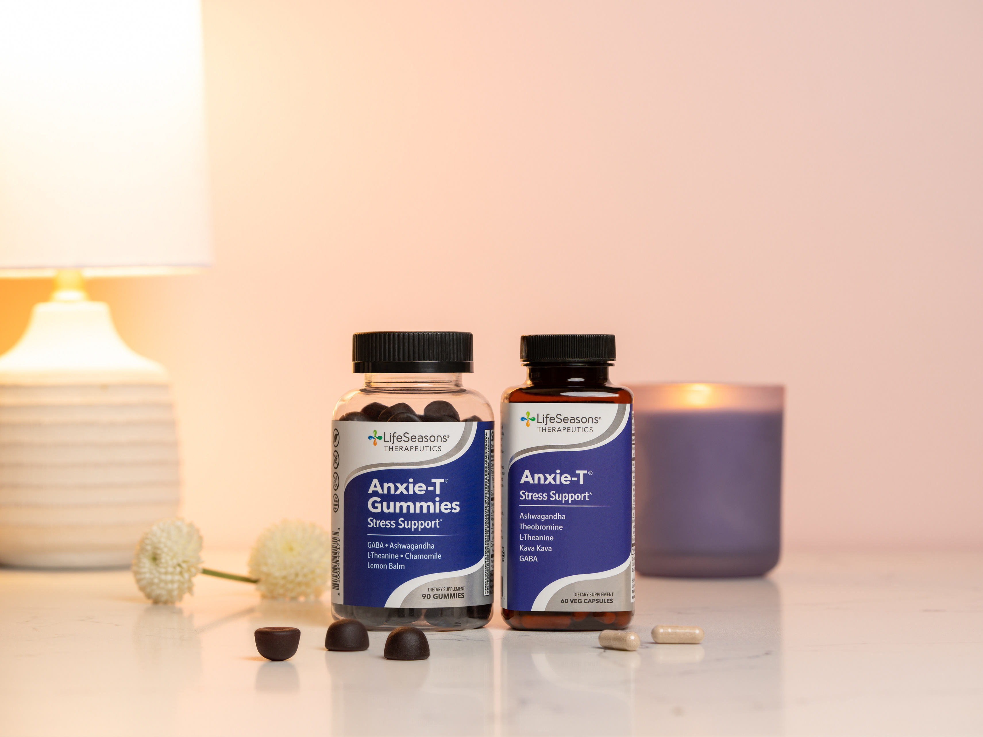
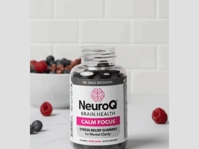
NeuroQ is a $10 million supplement brand endorsed by world-renowned neurologist Dr. Dale Bredesen. It is dedicated to enhancing both short—and long-term brain health as we age. As my first project while employed as the UI/UX Designer at parent company LifeSeasons, I was tasked with redesigning the website for NeuroQ, their top-selling brand, to coincide with the launch of the flagship product’s new label.
Process
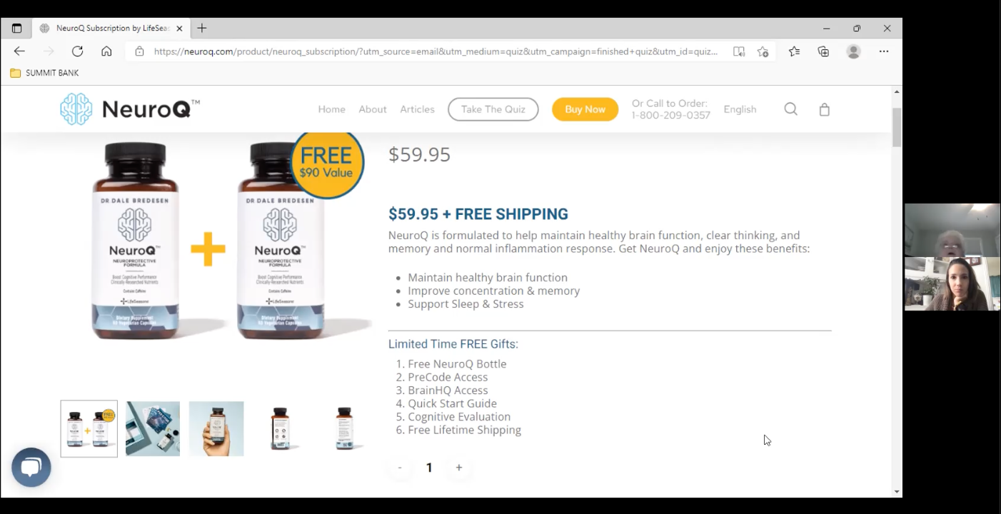
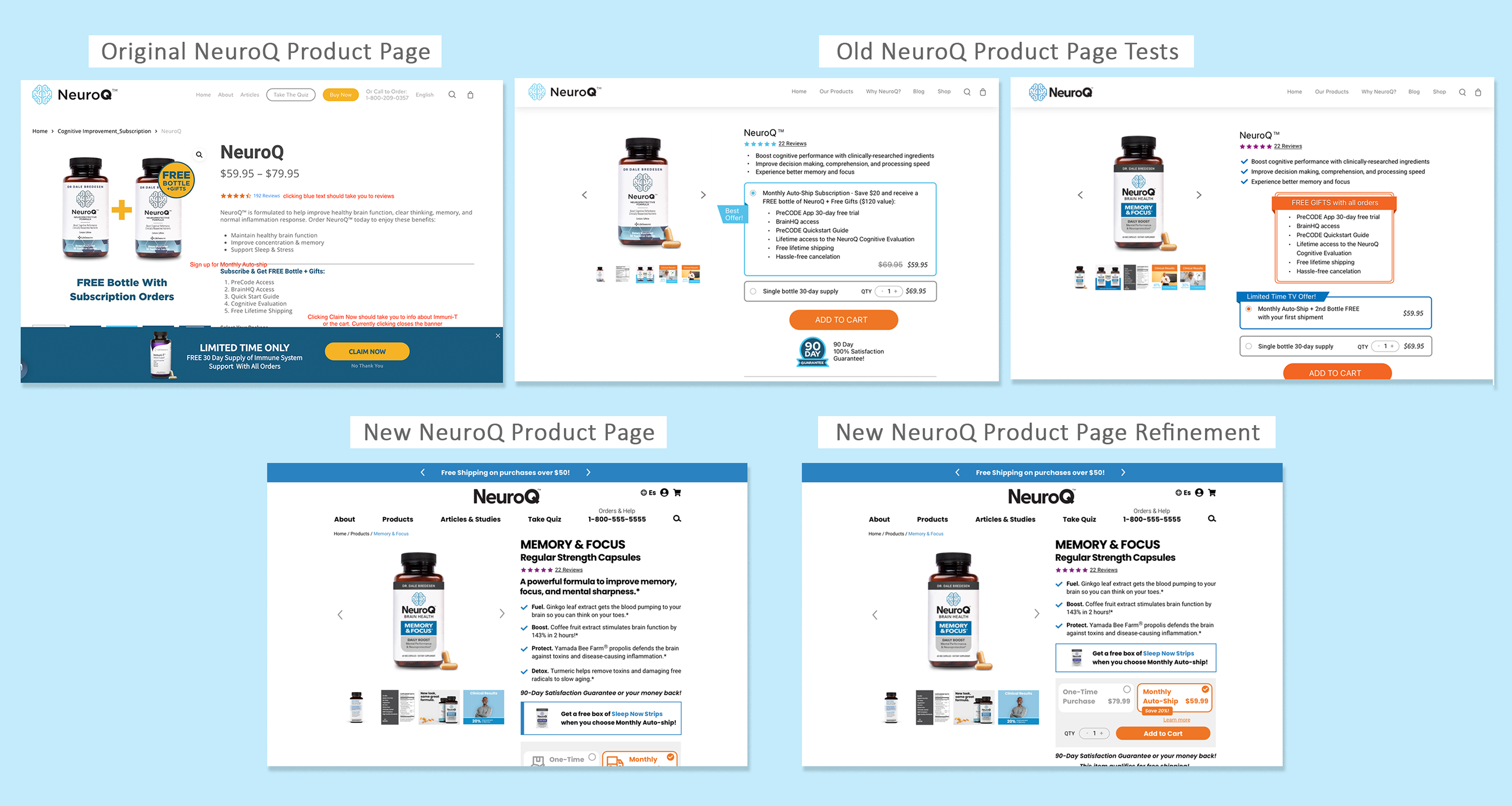
In my evaluation of the existing site, I found dense sections of text, design inconsistencies, and confusing elements within the checkout process. At the time, the site was designed to sell one product, so most CTA buttons led to the product page.
User Interviews
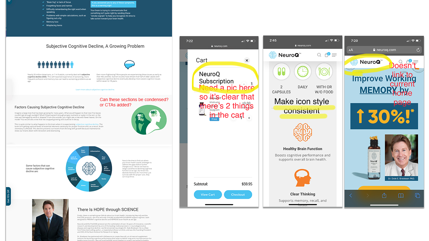
I conducted user interviews that revealed a lack of clarity on the product page. Questions included, “Is there a free product offered?” “Is this a subscription?” “Will I get a reminder when my product will be charged and auto-shipped every month?” “Can I get my money back if this product doesn’t work for me?” We uncovered issues with the navigation as well, such as confusion over what the bag icon was and where to find answers to their product questions.
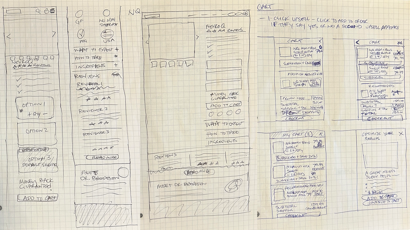
Wireframes
To create the wireframes, I collaborated with the Lead Product Developer who had also designed the new product labels. Incorporating the user feedback, I filled in details to flesh out his initial ideas. Loosely sketched wireframes were turned into more refined pixel-perfect mockups in Sketch for handoff to the development team.
Visual Design
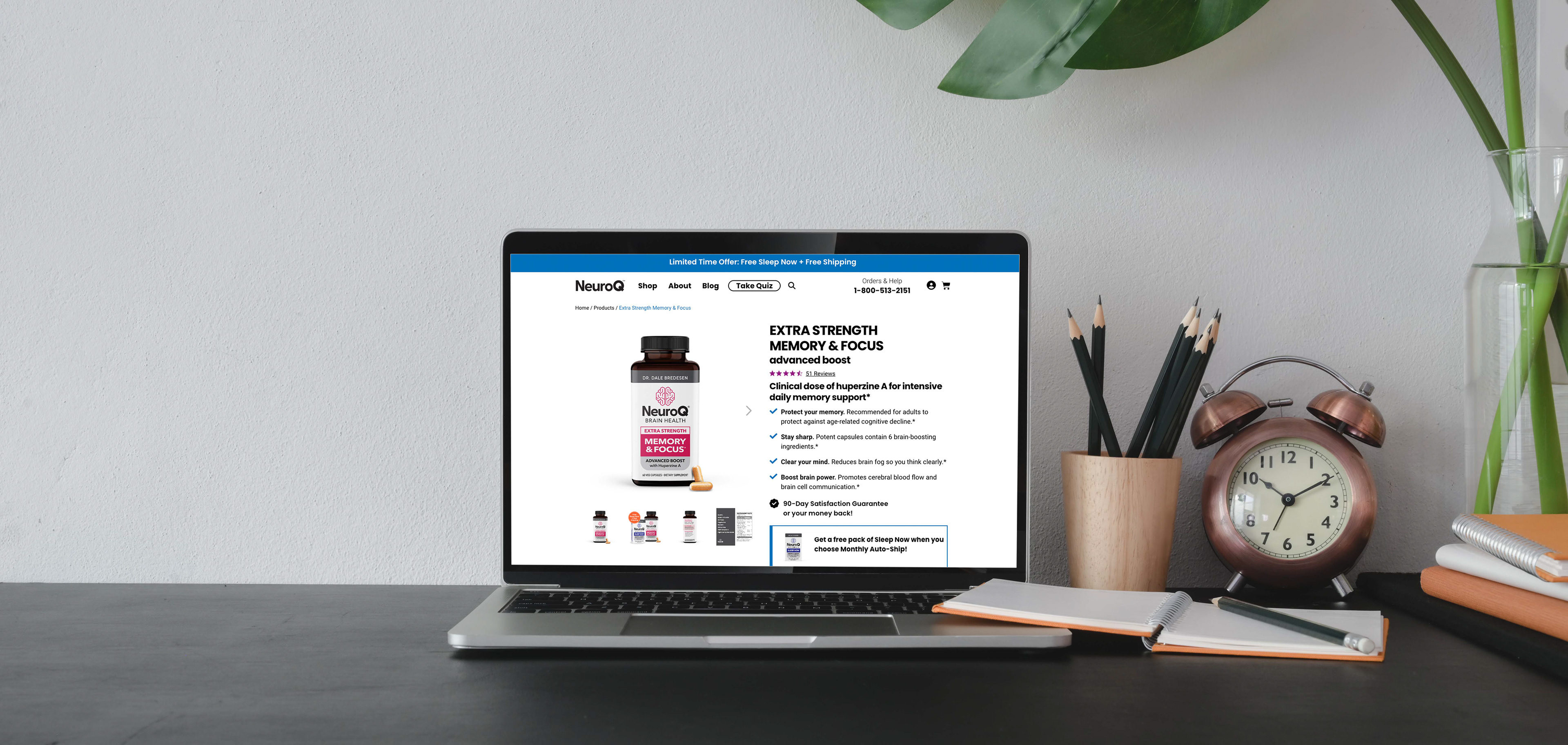
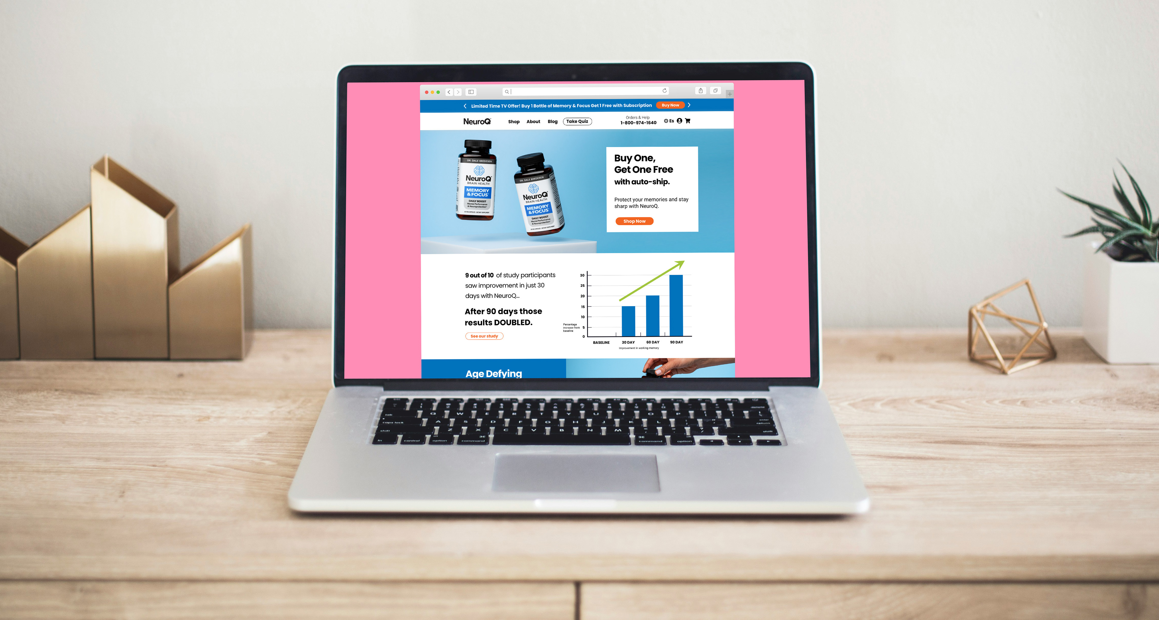
The label redesign coincided with the website overhaul, prompting a complete brand refresh. To initiate conversations with the brand team and lead product developer, I created mood boards to explore a new visual direction. We aligned on a UI that reflected the desired customer experience—bright, energetic, and clear. We chose bold sans-serif fonts, vibrant colors, larger icons for clarity, and generous white space to reinforce the sense of focus.

Iteration
We A/B tested the product pages regularly to optimize conversion. The original product page displayed the add to cart button below the fold, and we discovered that while conversion was fairly good, retention was poor as customers were not realizing they were signing up for a subscription. We worked on clarifying the free gifts, changing the verbiage to Monthly Auto-ship, and moving the Add to Cart button higher. We also found that less text above the fold performed better.
Launch
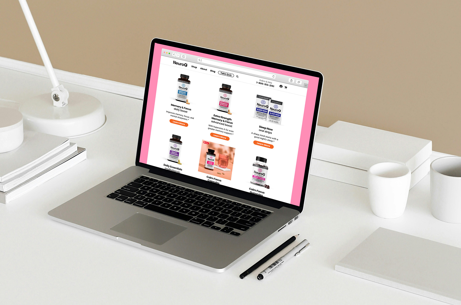
The launch of the new NeuroQ website allowed spaces for the sale of multiple products, and within the year, ten additional products were launched. Providing more clarity on the product pages and navigation led to fewer subscription cancellations and greater customer satisfaction. The visual design was kept clean, bold, and high-contrast to assist an older customer base likely to have more vision challenges and project the confidence we wanted customers to feel with improved brain health.